Brand Development
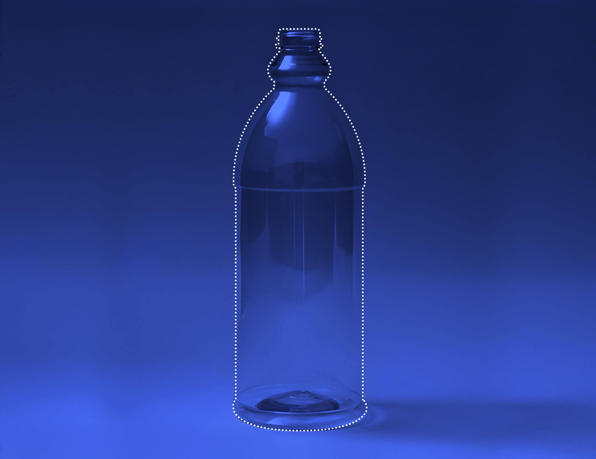
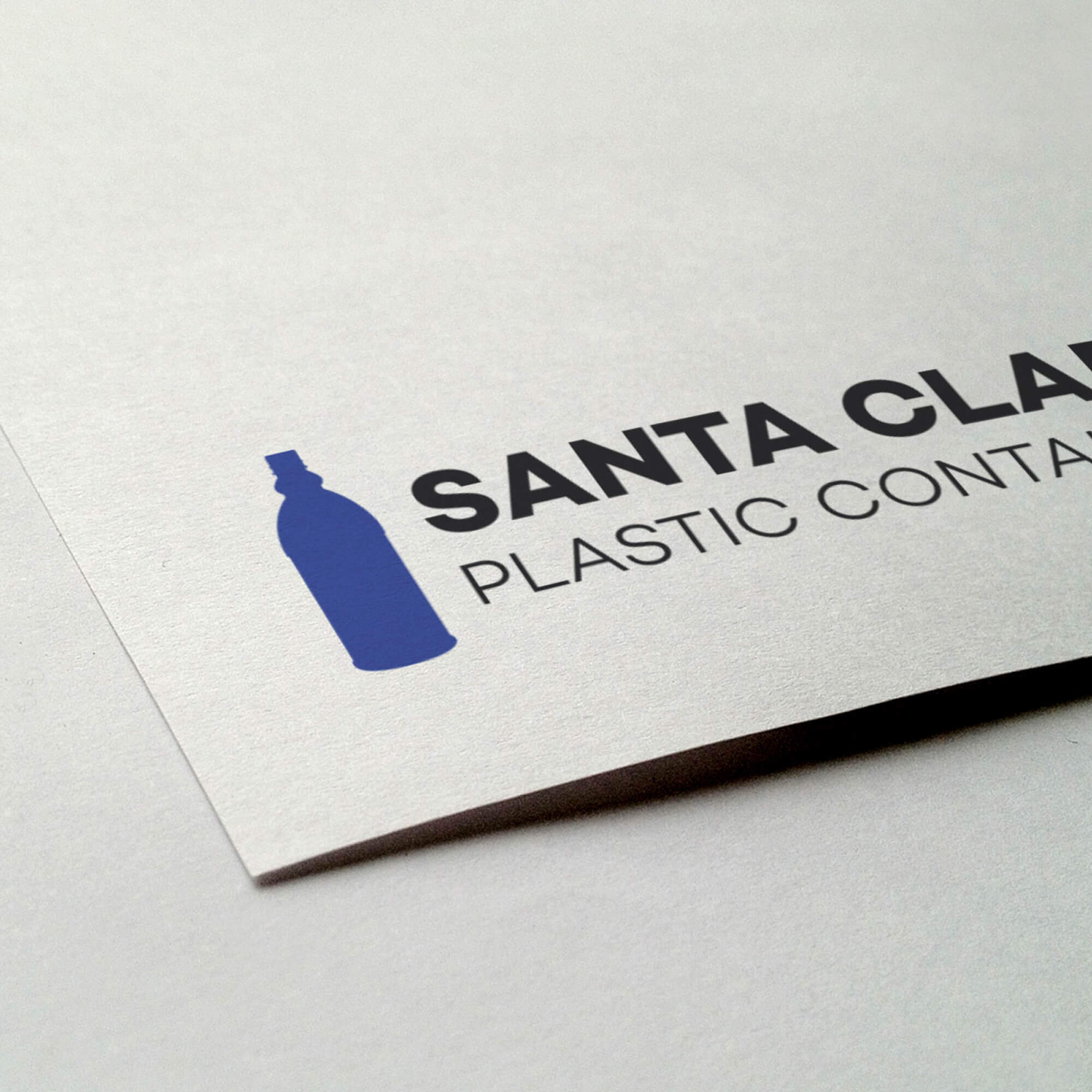
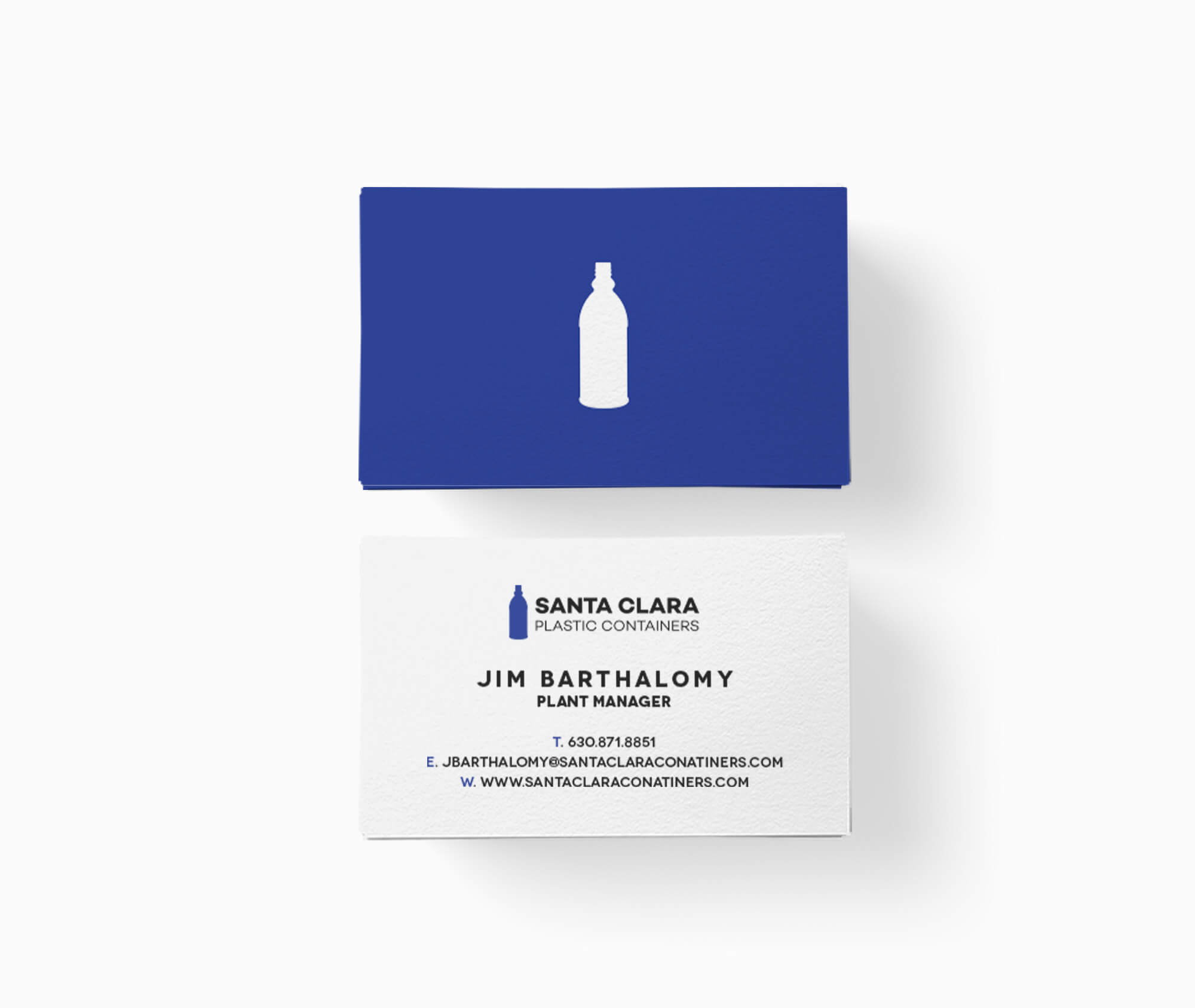
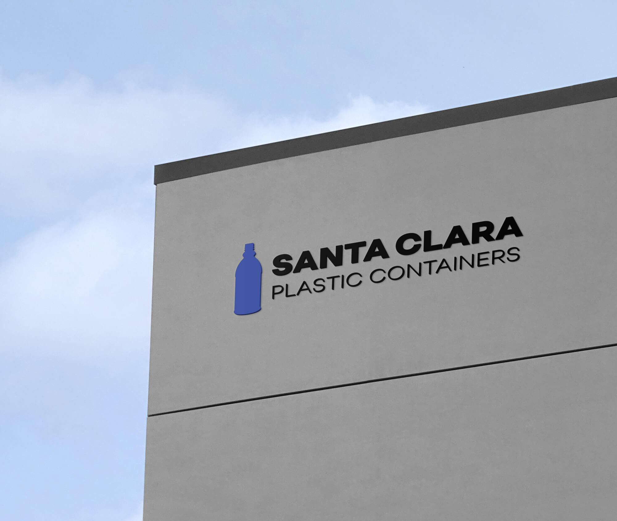
The identity combines a modern sans-serif wordmark with a custom bottle silhouette, directly referenced from a top-selling PET mold in Santa Clara’s line. This lockup emphasizes clarity and manufacturing heritage while remaining scalable, legible, and easy to deploy across web, print, and labeling.
- Modern sans-serif wordmark for clarity and confidence
- Bottle icon modeled on a core PET mold to anchor brand relevance
- Simple, strong forms → excellent small-size legibility
- Flexible lockups for packaging, web, and documentation


Design Type
Typography
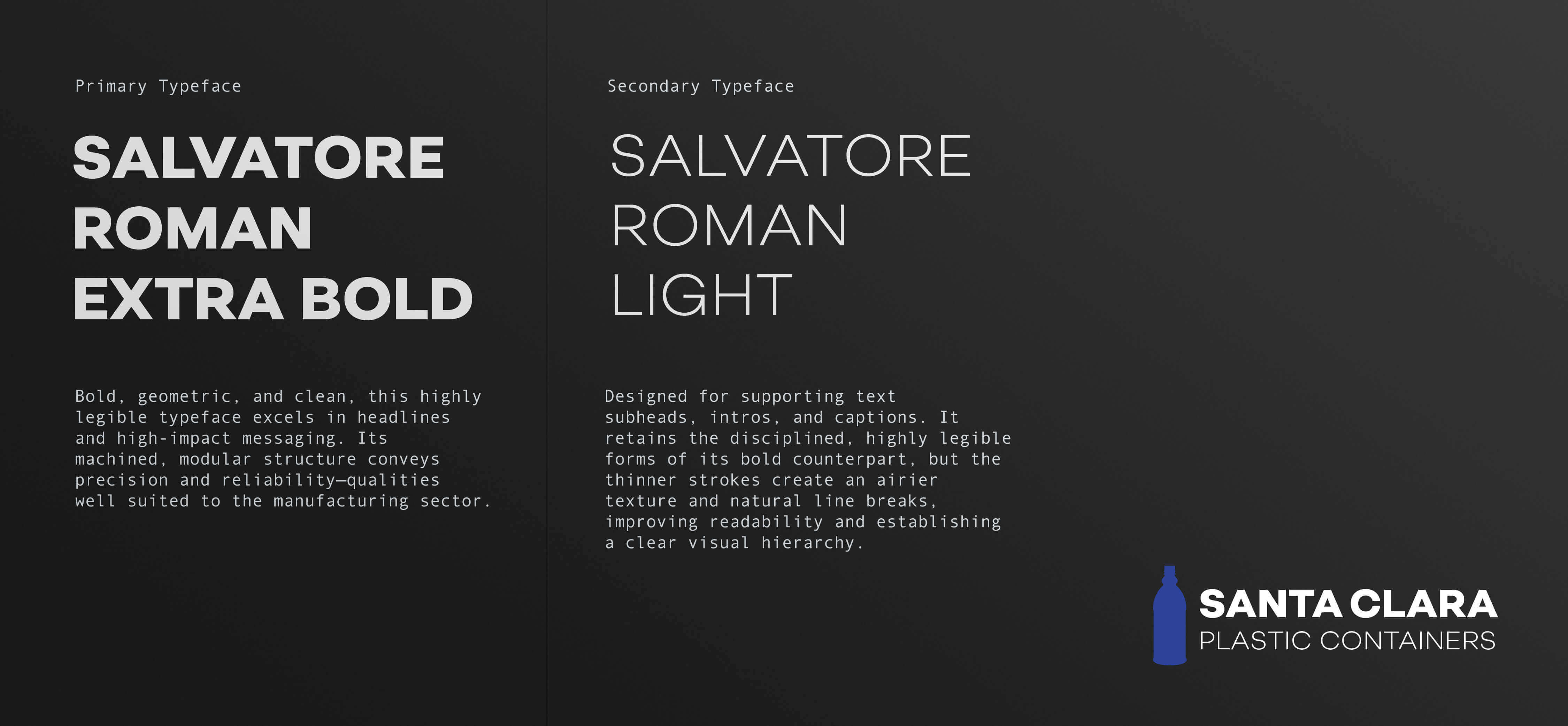
Salvatore Roman is the typographic foundation of the Santa Clara Plastic Containers identity. Chosen for its Grotesk lineage and balanced proportions, it provides both strength and clarity. The Extra Bold and Light weights are used in concert—the former for presence and impact, the latter for refinement and contrast—creating a distinctive, readable logotype.
Design Language
To support navigation and storytelling, we created a suite of custom icons representing Santa Clara’s manufacturing categories, including personal care, cosmetic, and beverage lines. Each glyph uses a consistent grid and stroke, ensuring legibility at small sizes, seamless scaling as vector assets online, and clean reproduction online or in print.
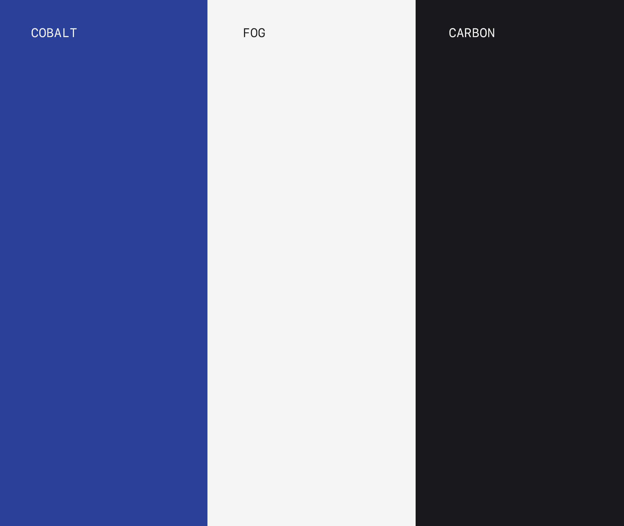
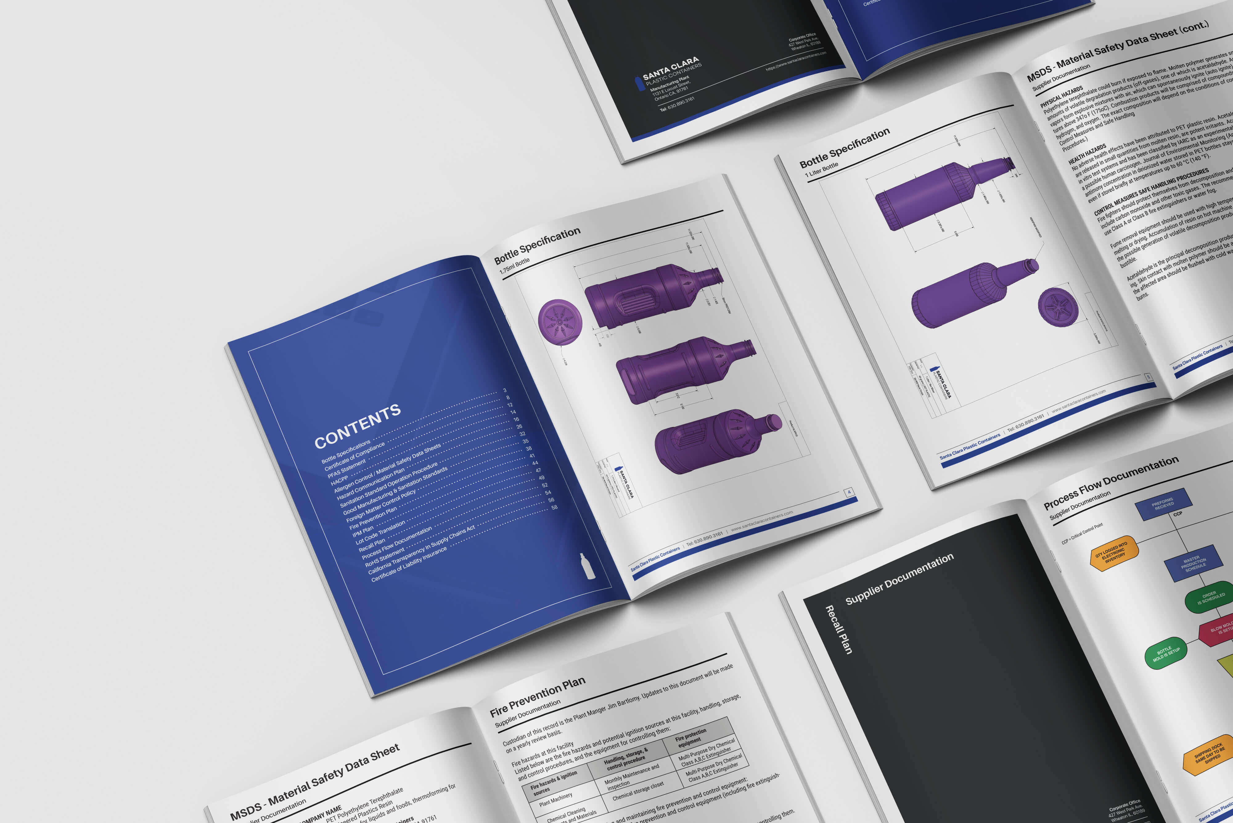
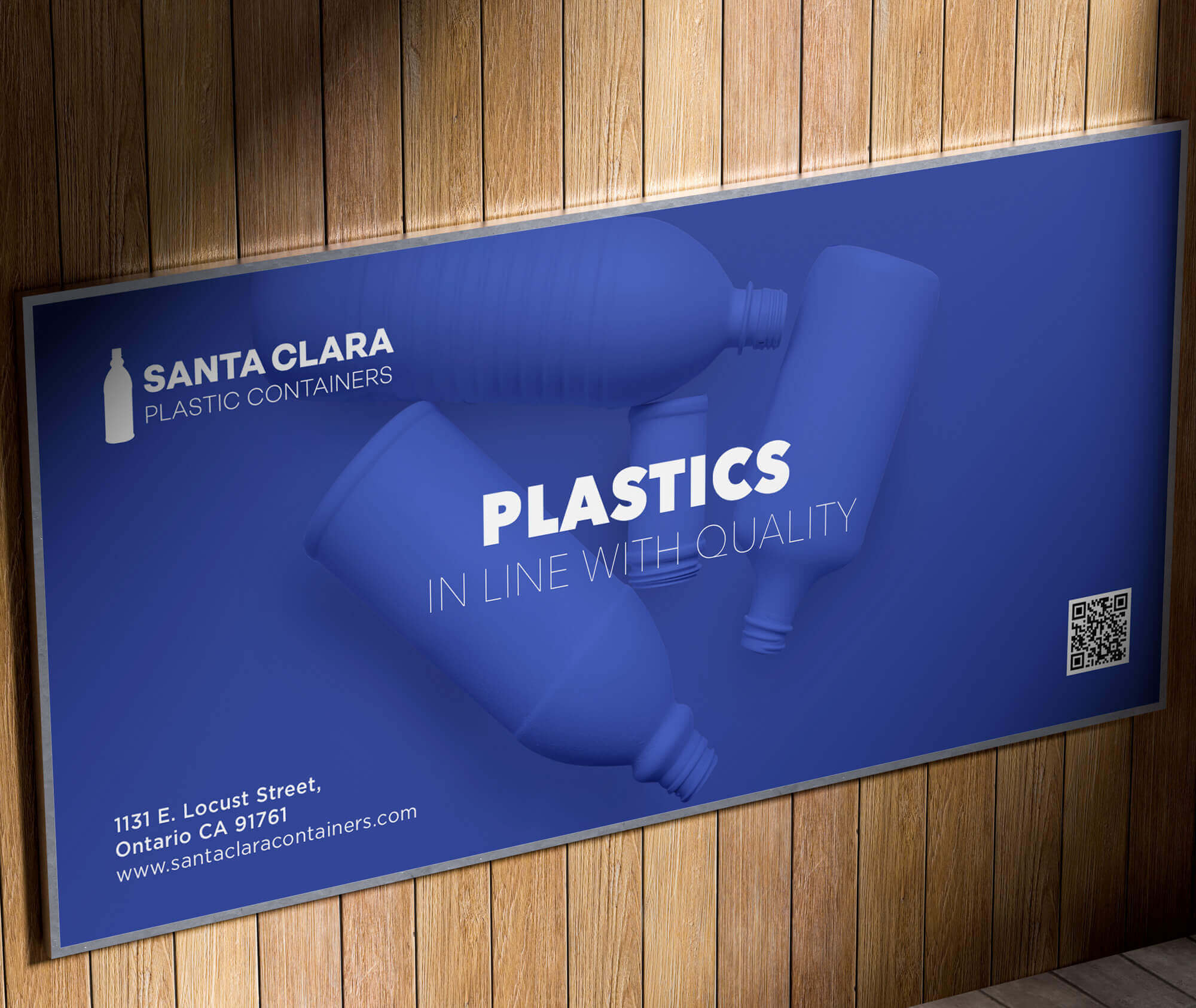
We crafted a clean color system that would extend beyond the Santa Clara brand and provide a solid foundation for a variety of print materials and advertisements.
Interactive
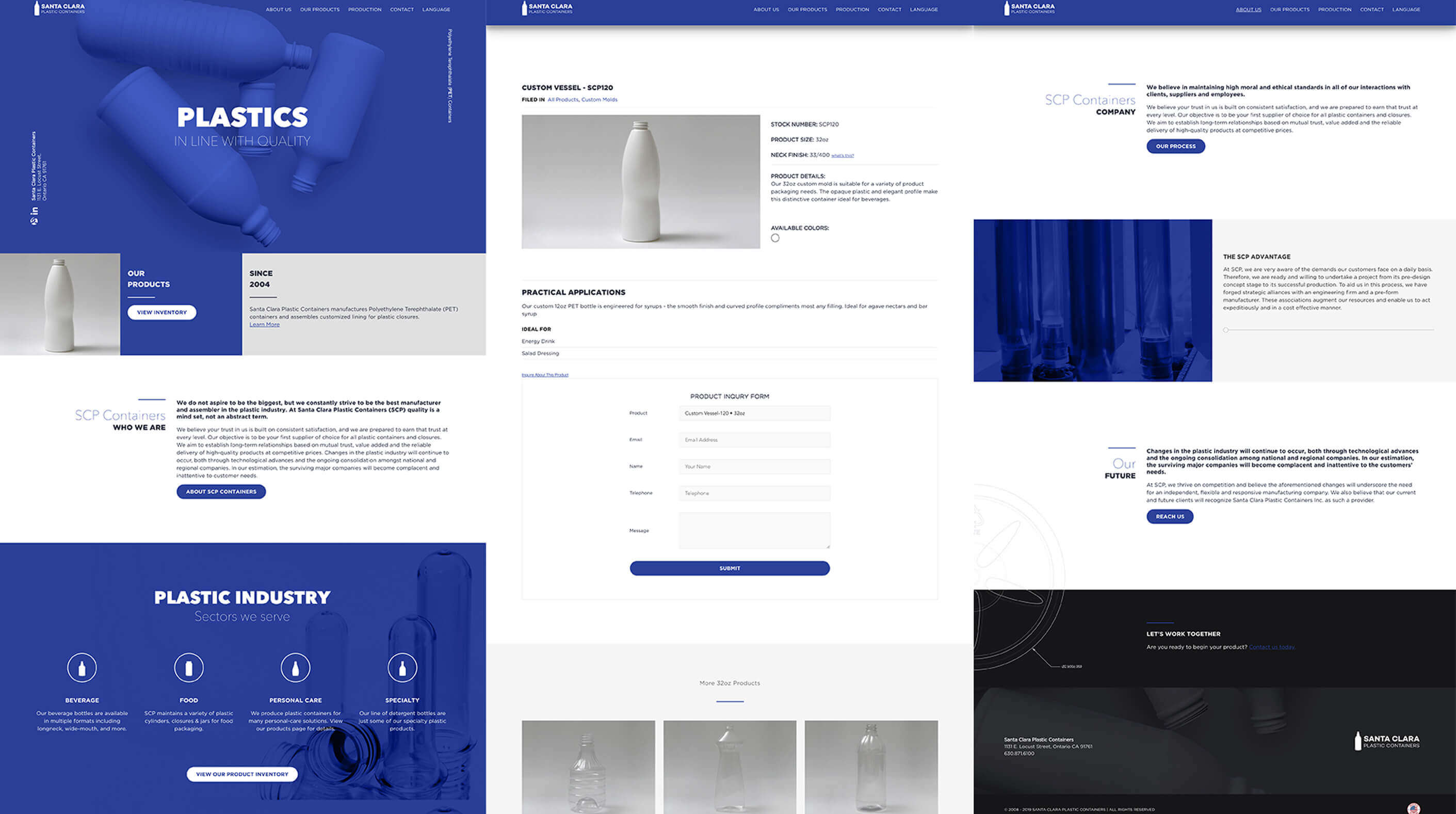
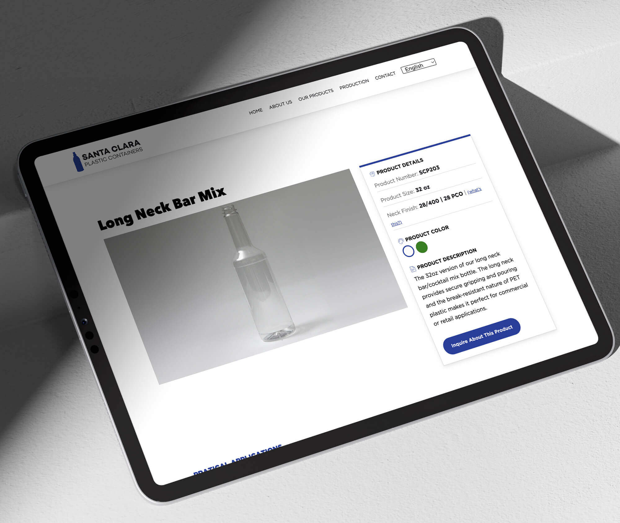
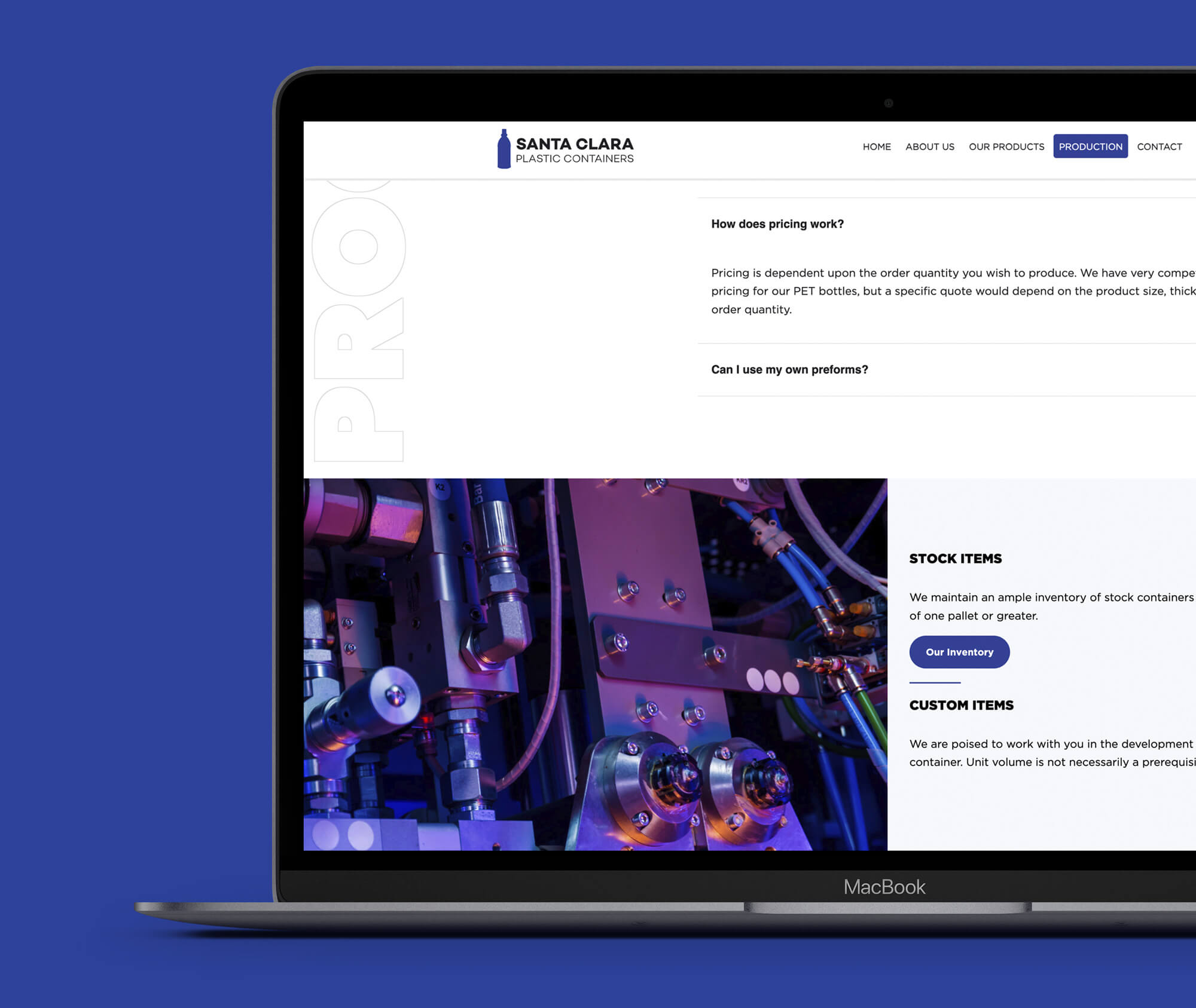
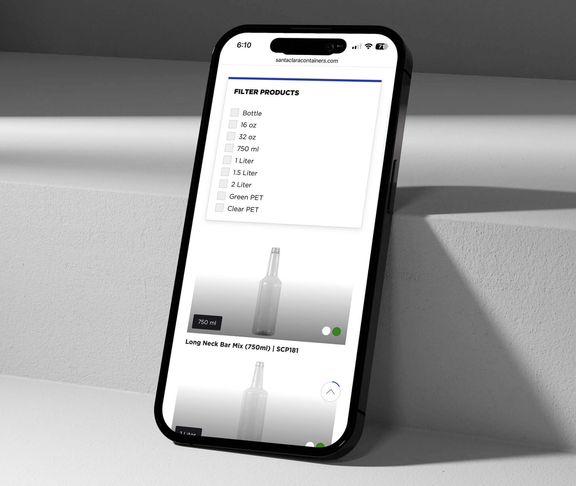
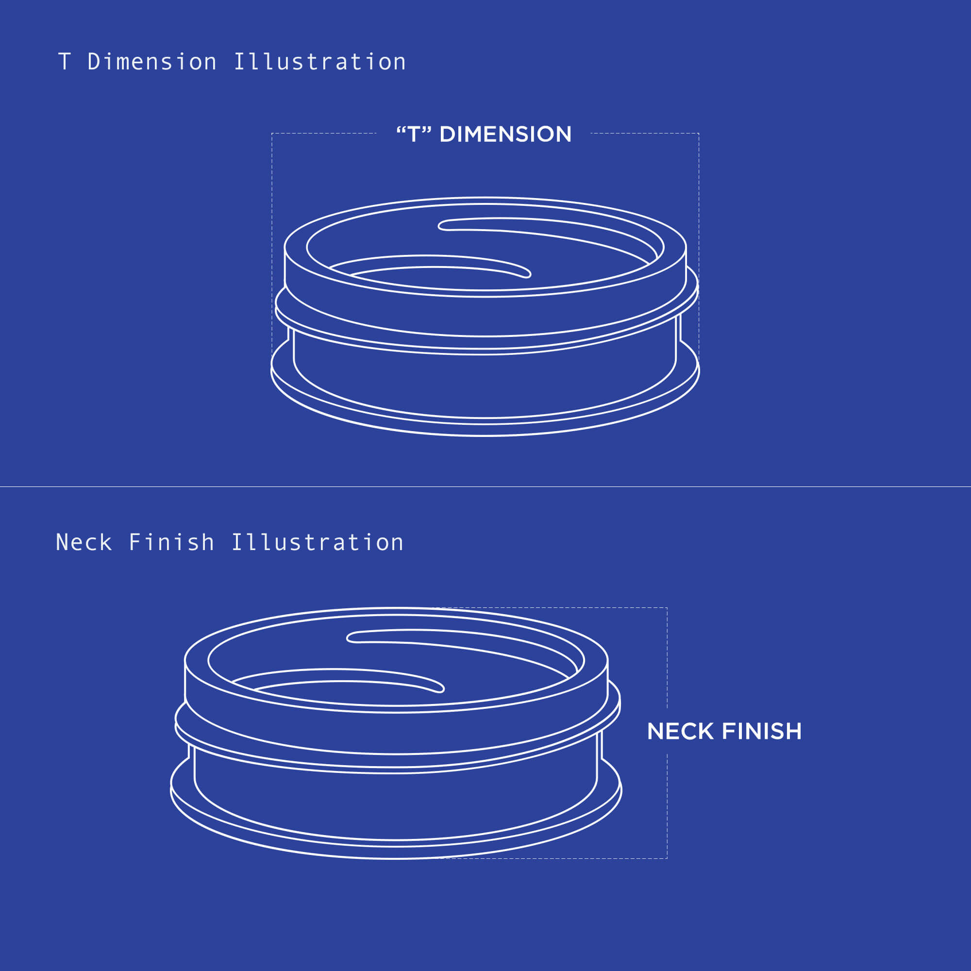
To simplify catalog updates, we implemented a custom WordPress theme with structured product fields—weight, size, color, thread style, and more—so the team can add and edit items without developer support. The result is a cohesive, responsive experience that surfaces key specs, improves findability, and reduces friction for sales inquiries. Since launch, the site has produced a 20%+ lift in qualified leads.
