NGC
Identity Update.
11/29/19
The contemporary presentation of the NGC logo capitalizes on space and creates a sophistication and timelessness that strives for balance and legibility"
Building an identity
National Gift Card wanted to update their brand and approached us to reimagine their identity design. The company has been embracing a more technology first approach with a focus on mobile payments and electronic gift cards. With this change, National Gift Card elected to change their name to simply NGC. Our mission was to craft a design that the NGC executive team felt embraced the company's trajectory and ethos.
Some background: NGC exclusively serves markets across the United States and Canada. With a 92,000 sq. ft. fulfillment center, NGC is a leading gift card fulfillment and sourcing resource for companies of all sizes. With a proprietary gift card ordering portal, gift card API platform and mobile fundraising program, eTecc know that NGC needed a brand that reflected their evolution.
The Ideation
NGC gave our team carte blanche to concept their new identity. We looked back at the company's history of logos as a point of reference before designing:
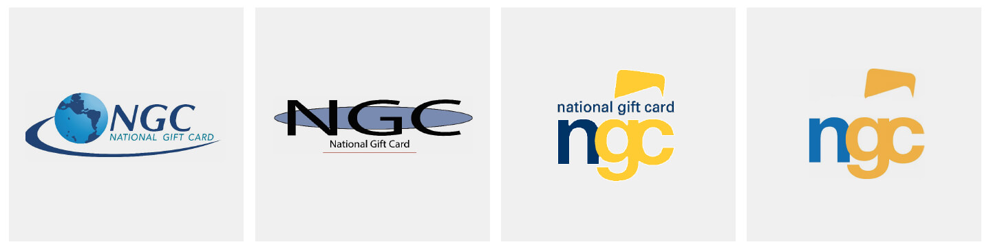
The Brand History
The legacy of NGC is rich. The company has experienced an evolution of their brand as they have continued to expand. Looking back at the previous iterations of the identity gave our team a point of reference for our own exploration of a new identity.
After some initial ideation we decided that a minimal and geometric concept would suit the new identity. The inspiration for the letterforms came from the lemniscate symbol. The connected and rounded shape of the lemniscate/infinity symbol inspired us because of the visual balance it provides. We knew that all three of the characters in the "NGC" brand were equally important. The equality and fluid movement of the lemniscate symbol worked as a template for our own design.
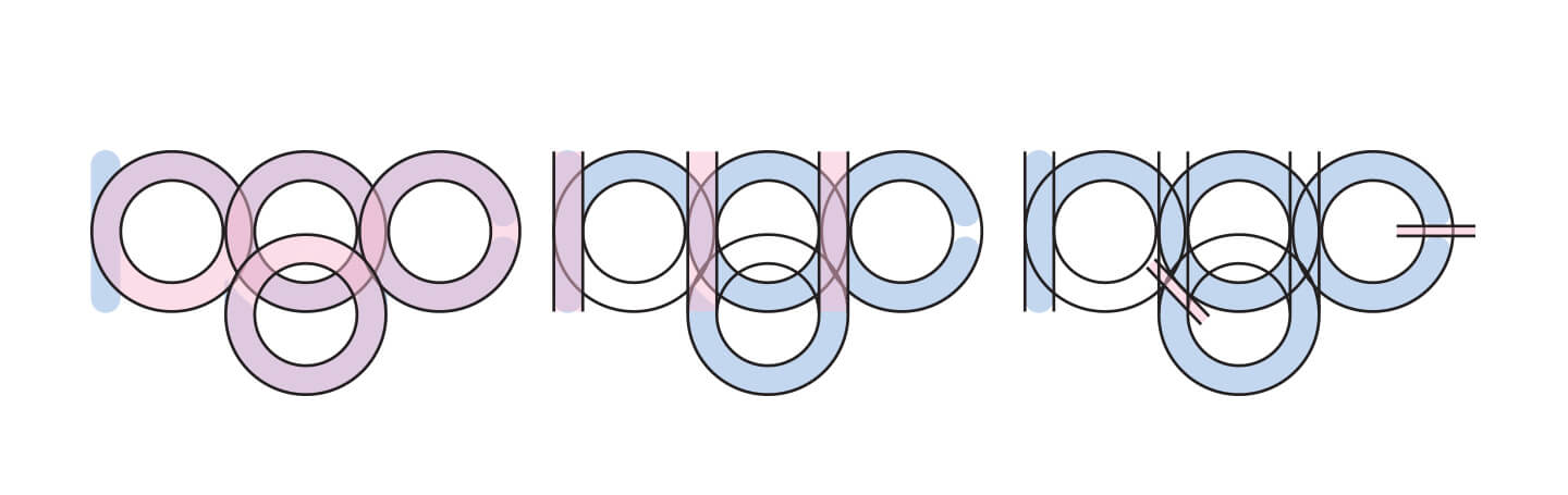
Logo Anatomy
The Color
We selected a gradient of colors for the finished identity design. The initial blue color at the start of the graident is a nod to the legacy of the NGC brand. After isolating an Cornflower Blue (a blue consisting of little amounts of green), we transitioned the color into a China Pink. The combination of these two colors creates a pleasing mixture of purple where the blue and pink intersect. To complete the end of the graident we chose an Apricot Orange. The finished effect of the entire gradient is a freshing spread of hues that looks modern and progressive.

The Color Palette
The Final Brand
The NGC logo is a compound figure comprised of four curved shapes and intersecting lines of equal weight. These shapes combine to create a custom lowercase letter-type. The linear nature of the letter forms indicate a transactional or continuous process. We added a subtle drop shadow to create a small amount of lift on the "g" character.
The completed design is modern and intentionally minimal, signaling the simplicity and effectiveness of NGC’s product goals. The contemporary presentation of the NGC logo capitalizes on space and creates a sophistication and timelessness that strives for balance and legibility.
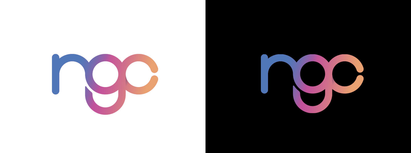
The Final NGC Identity